Brand Design
Translating founders' visions into cohesive visual languages — from strategy and discovery through logo, color, typography, and extensible identity systems.
How I Approach Brand Design
Brand design isn't about creating a logo. It's about translating a founder's vision, values, and unique perspective into a cohesive visual language that resonates with their audience and endures over time.
I approach each project as an exercise in discovery and strategy, starting with deep understanding before making anything visual. The result is a system that's both intentional and flexible — designed to scale with the brand as it grows.
01 — Process
Strategy Before Aesthetics
Discovery & Strategy — Deep conversation with the founder to understand who they are, what they want the brand to represent, and what makes them distinct. Analysis of target audience, competitive landscape, and market positioning.
Visual Development — Multiple logo explorations and lockups for different applications (social, print, merchandise, web). Establishing color palettes, typography pairings, and visual tone.
Extensibility — Designing systems, not single assets. Multiple logo lockups for different contexts. Documenting typography scales, color usage, and tone to ensure consistency at scale.
"The goal is a brand that feels inevitable — like it couldn't be any other way — while remaining durable enough to grow with the business."
02 — Selected Work
Brand Identities
The Chef in Pearls · Culinary / Brand Identity
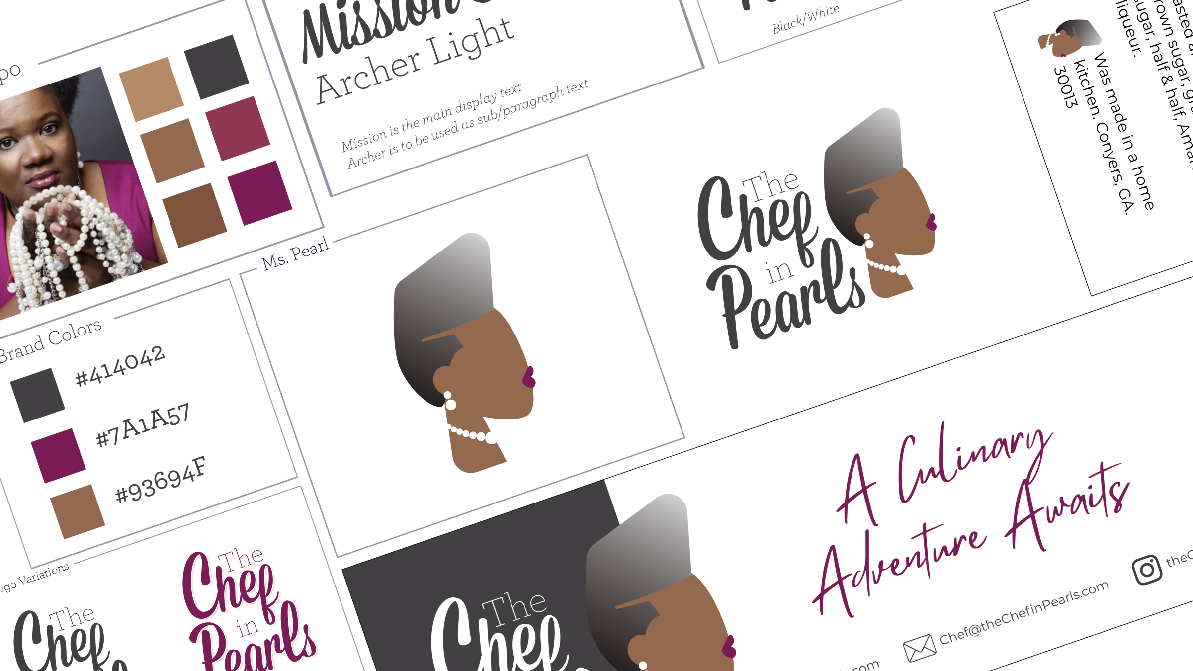
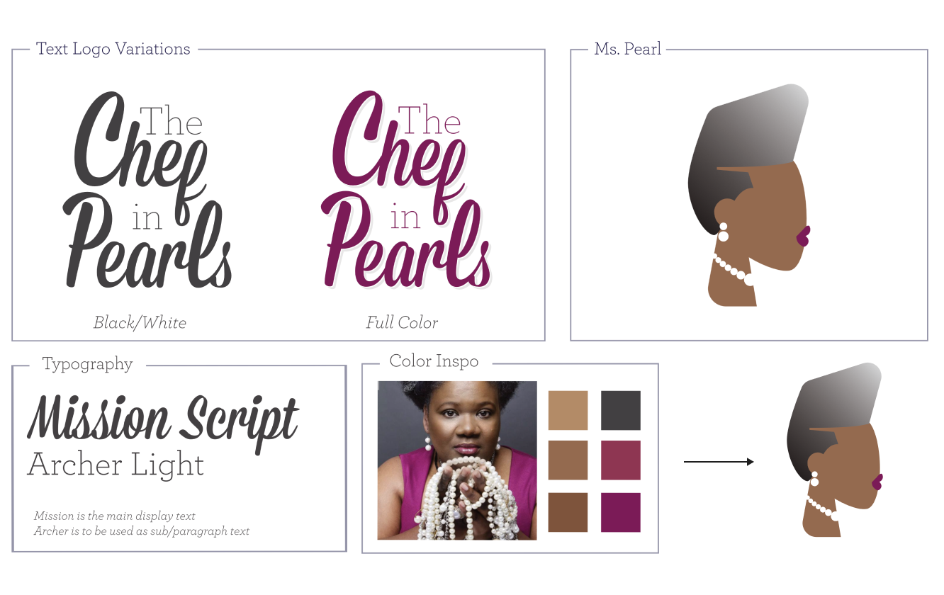
Chef Sinclair’s brand was a fun endeavor. This was a fun challenge to create a character to represent the brand. In the end we had a lot of brand elements to work with for a variety of uses. Ms. Pearl is one of my favorite artifacts to date, and I look forward to animating her in the future!
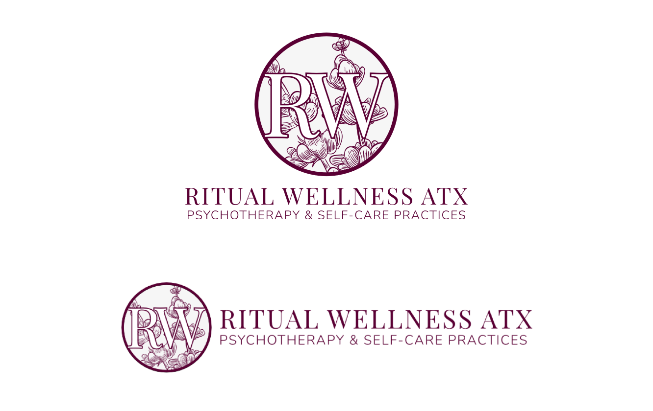
Ritual Wellness ATX · Therapy & Psychology / Brand Identity
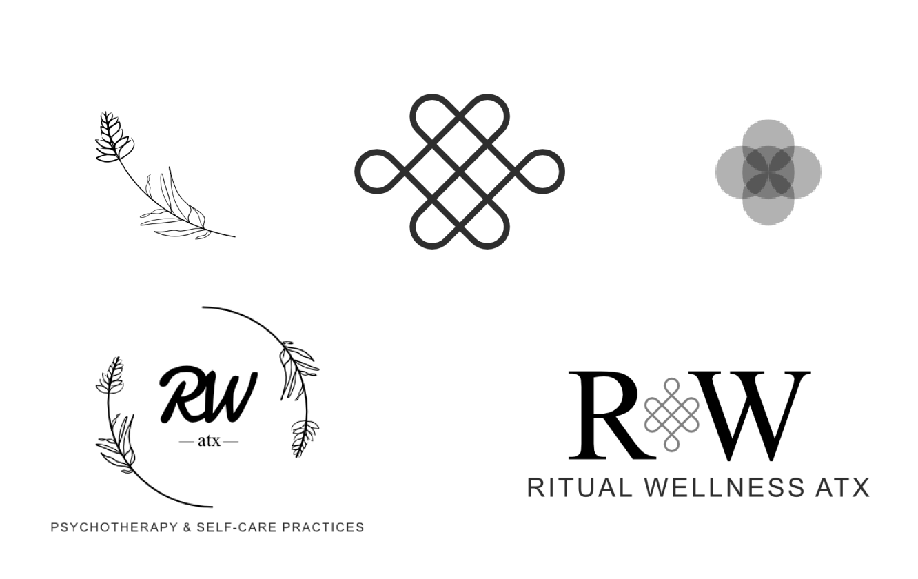
Ritual Wellness ATX is a therapy practice local to Austin Texas. Shown above are some of the explorations we went through for the initial discovery phase of the brand. lavender was a key element as it represents calm/peace and it grows all over Austin. The endless knot was a call to harmony, balance and wisdom from Buddhist practices. Last symbol in the top row is the 5 fold symbol which is a Celtic representation of balance in human nature. Ultimately we kept lavender as a key element in the background of the final and went with a circular mark that can be recognized easily outside of the full logo lockup.
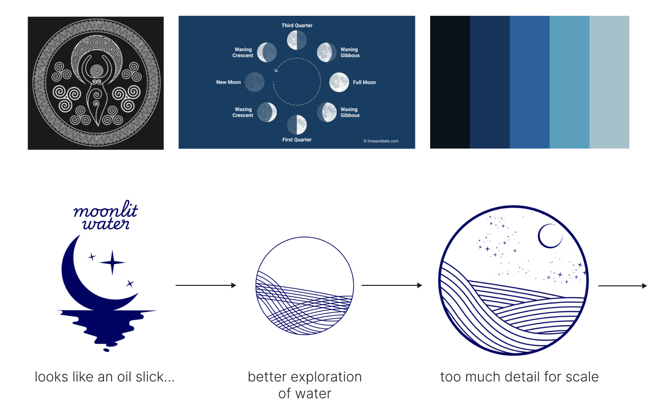
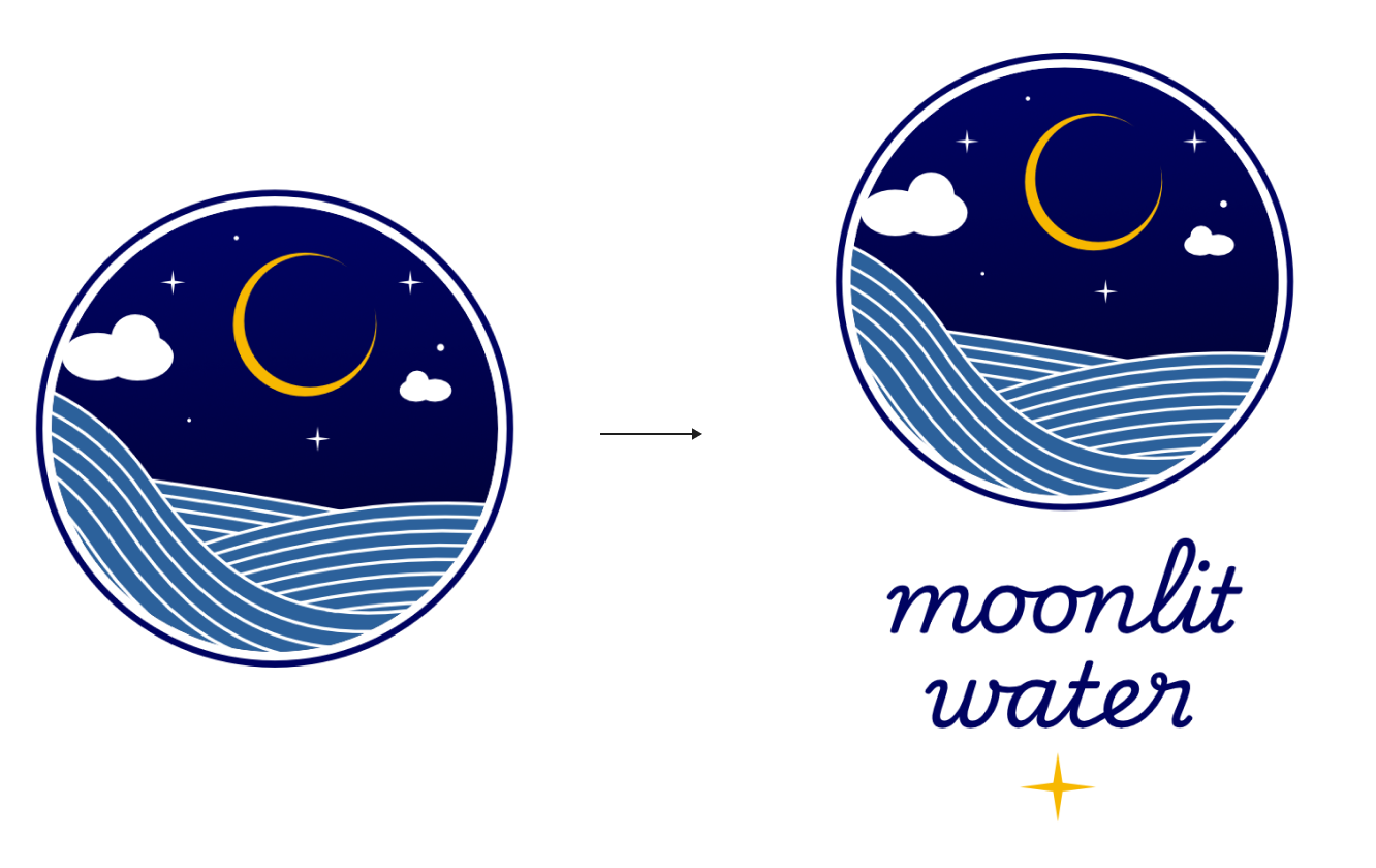
Moonlit Water · Holistic Healing / Brand Identity
The founder of Moonlit Water wanted a more literal representation for their mark. For inspiration we explored linework, moon phases and a blue pallet. After a few iterations in direction we settled on the path you see above and refined from there. I’m looking forward to working more with Moonlit to roll out the rest of their brand guide and marketing materials.