About me (Akeem)
I'm a designer based in Aurora, Colorado, crafting digital experiences & creating brands that feel intuitive, purposeful, and human.
With over a decade of experience working at the intersection of product strategy and UX design, I partner with organizations to understand real user needs and translate them into products people genuinely love to use.
When I'm not designing, you'll find me working on something in the garage or spending quality time with my family out here in Colorado.
Core skills
Product Design
UX Research
Design Systems
Prototyping
Client Management
Brand Development
Team Leadership
Photography
Motion Design
Tools & stack
Experience
Senior UX/UI Design Manager
Q2 Software — Austin, TX
Led a cross-functional design organization managing 6 designers, 2 engineers, 1 product owner, and 3 junior design managers. Over five years, I directed several organization-wide initiatives that changed how we approach design quality, documentation, and customer engagement.
UX/UI Designer
Q2 Software — Austin, TX
Designed and shipped 12+ features across our productized extensions suite while establishing the design rigor and user validation practices that would later scale across the organization.
Senior Interactive Designer
Protect America — Austin, TX
Owned design and optimization of high-traffic pages for our marketing and sales funnel. My focus: testing, learning, and iterating based on data to enable our sales teams.
I ran A/B testing experiments on conversion-critical pages, improving conversion rates across the portfolio. Those improvements of course translated to revenue—a clear reminder that good design isn't just about aesthetics, it's about moving business metrics.
Using data to prioritize which pages to redesign next and how to refine messaging and positioning became my default way of thinking about design impact.
Creative Director
Strategis Advertising — Stoughton, MA
Led creative direction and production for digital and traditional campaigns across 10+ client accounts. Managed a team of 2-3 designers through the full project lifecycle—from initial brainstorms through final delivery.
Designed websites, landing pages, and digital assets across WordPress, HubSpot, and Umbraco platforms. I developed brand strategies for clients and presented marketing recommendations that directly influenced their business decisions. This role taught me how to think like a strategist, not just a designer.
Web / Graphic Designer
Division of Student Affairs — Georgia State University, Atlanta, GA
Designed print materials, web assets, and campaigns for 8 offices within the Division of Student Affairs. I managed the full lifecycle from concept development and creative direction through final production. This was my first design role and taught me the fundamentals of creative problem-solving under deadline.
I'm a designer based in Aurora, Colorado, crafting digital experiences & creating brands that feel intuitive, purposeful, and human.
With over a decade of experience working at the intersection of product strategy and UX design, I partner with organizations to understand real user needs and translate them into products people genuinely love to use.
Below is a selection of projects where I've led design strategy, built systems, and collaborated across teams to bring visions to life.
Work
Translating a strategic visual overhaul into embedded organizational practice across design, product, and engineering teams.
From problem to functional tool in one afternoon — a precision calculator built for performance automotive enthusiasts who blend their own fuel.
A selection of brand identity systems — from discovery and strategy through logo development, color, typography, and extensible visual guidelines.
Full-cycle motion work — from storyboard and concept through animation, editing, and final delivery. Strategy-first storytelling across brand films, logo animations, and more.
A ground-up redesign of a local coffee shop's web presence — warmer visuals, an integrated menu, and seamless order functionality that reflects the experience of walking through the door.
Translating a strategic visual overhaul into embedded organizational practice across design, product, and engineering.
When our lead designer came to my team with a strategic vision for a comprehensive visual update to our online banking platform, I took ownership of translating that vision into organizational reality. While our Director sponsored the initiative, my role was to bridge design intent with product and engineering execution — ensuring that strategy became embedded practice across the organization.
The challenge was multifaceted: align disparate teams around a new visual system, maintain consistency across hundreds of components, and equip product teams to self-serve variable configurations without constant design involvement.
02 — Approach
I built a three-part methodology to ensure successful implementation:
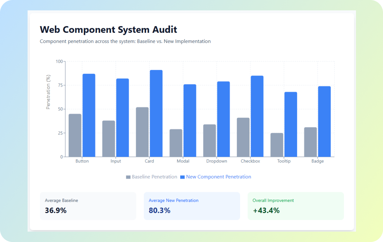
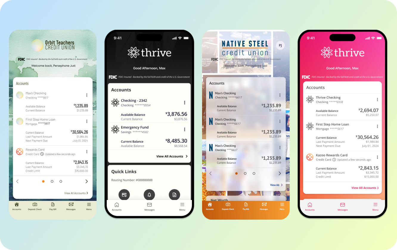
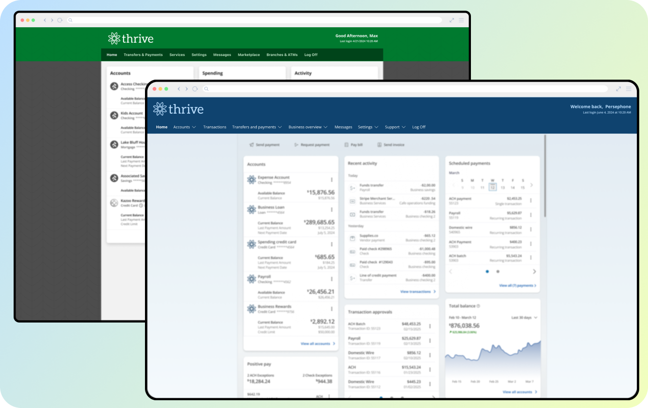
Platform Audits — Systematically documented visual inconsistencies and gaps across the existing platform, creating a baseline against the new system standards.
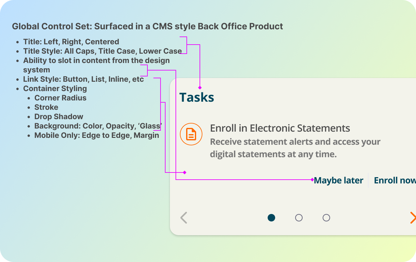
Cross-Functional Alignment — Facilitated structured meetings with product and engineering teams to align on implementation, not debate. The goal was clarity: ensuring visual assets matched system output and that new UI variables were properly exposed in our back office system.
Knowledge Transfer — Designed workshops to coach teams on component consumption, establish clear handoff standards, and create specifications that eliminated ambiguity in development.


03 — Execution
The implementation phase required constant coordination between design vision and engineering feasibility. My work centered on three key deliverables:
Variable Configuration System — Worked with engineering to expose thousands of new UI variables in the back office, enabling product teams to configure visual options independently rather than requesting design support for every change.
Documentation & Specifications — Created comprehensive asset handoff documents with clear specifications that eliminated ambiguity and reduced back-and-forth cycles between design and development.
Team Workshops — Conducted targeted sessions coaching teams on component consumption, establishing visual standards, and demonstrating how to achieve consistency using the new system.


04 — Impact
The outcomes extended far beyond the initial visual update. By creating infrastructure for self-service configuration and establishing clear system standards, we transformed how the organization builds and maintains visual consistency.
1K+
New UI variables added to system
2–3
New navigation styles implemented
↓ Dev
Self-service config reduced dev cycles
Sales & Leadership Enablement — Assets became foundational materials for prospect presentations, positioning our design maturity as a competitive differentiator.
Engineering Efficiency — By exposing variables for configuration, product teams gained independence. Development time decreased because design didn't become a bottleneck for visual variations.
Design System Maturity — New platform features began adopting visual standards with consistency we'd struggled to maintain before. The system wasn't just designed — it was embedded into how the organization builds.
05 — Takeaway
"Even the most thoughtful design strategy fails without operational discipline."
This project taught me that my role was less about designing and more about creating the conditions for the vision to succeed — auditing, aligning, equipping, and removing friction. The result wasn't just a visual refresh. It was an organization that could sustain design consistency at scale.
Rapid prototyping a precision tool for performance automotive enthusiasts who blend their own fuel.

As someone who modifies my own street car for performance, I've invested in custom tuning that requires specific fuel blends — particularly ethanol blends like E30. The challenge is straightforward but overlooked: how do you know the exact ethanol mix you're creating when you fill up at the pump?
Your 13-gallon tank has 6 gallons of 91 octane fuel already in it. You want to fill to E30. How much ethanol do you add to hit your target blend? The math isn't intuitive, and getting it wrong can detune your engine or cause damage.
Play around with the current iteration of the web app here:
Flex Fuel Buddy
02 — Why Build It
This wasn't just a personal convenience — it was a test. I'd noticed the same question asked repeatedly in automotive forums. People were guessing, doing math on paper, or avoiding fuel blending altogether because the uncertainty wasn't worth the risk.
I chose to build in Lovable.dev to explore the platform's rapid prototyping capabilities. Could I go from idea to functional tool in a single afternoon? That constraint forced clarity: build only what's necessary, make it intuitive, and get it working.
"Sometimes the best product solves a problem that feels too niche for traditional software — but resonates deeply with a specific community."
03 — The Solution
The calculator asks for three inputs and returns one critical output: exactly how many gallons of ethanol to add at the pump to hit your target blend. No guessing.
Tank capacity — Total gallons your vehicle holds.
Current fuel volume & octane — How much fuel is in the tank and its grade.
Target blend — The E-blend you want to achieve (E20, E30, E85, etc.).


04 — Building in One Afternoon
Building this in a single afternoon meant making ruthless decisions. No feature bloat. No unnecessary complexity. Just the core calculation, wrapped in a user experience that works at a gas station when you're focused on fuel.
Mobile-first design — You'll use this on your phone at the pump, not on a desktop.
Zero friction — No accounts, no sign-ups, no analytics tracking. Input → output → done.
Real-time feedback — See the result update as you type, not after submitting a form.
Lovable.dev's AI-assisted development was perfect for this timeline. I could describe what I needed, iterate quickly, and refine the UX without wrestling with boilerplate.
05 — Ongoing Evolution
The initial build solved the core problem, but using it in real life revealed opportunities: which inputs I adjust most, edge cases I didn't anticipate (different fuel grades at pumps, unusual tank sizes, regional ethanol availability), and what the community might need next.
I'm planning to release this to automotive enthusiast communities. That feedback will determine what features matter most: historical tracking, fuel economy calculations, community-shared tuning profiles, or something else entirely.
06 — Takeaway
This project reinforced something I believe strongly as a designer: sometimes the best products come from solving your own problem first, then discovering it resonates with others. The speed of execution — one afternoon — wasn't a limitation. It was a feature that forced ruthless prioritization and built something real rather than theoretically perfect.
Play around with the current iteration of the web app here:
Flex Fuel Buddy
Translating founders' visions into cohesive visual languages — from strategy and discovery through logo, color, typography, and extensible identity systems.

Brand design isn't about creating a logo. It's about translating a founder's vision, values, and unique perspective into a cohesive visual language that resonates with their audience and endures over time.
I approach each project as an exercise in discovery and strategy, starting with deep understanding before making anything visual. The result is a system that's both intentional and flexible — designed to scale with the brand as it grows.
01 — Process
Discovery & Strategy — Deep conversation with the founder to understand who they are, what they want the brand to represent, and what makes them distinct. Analysis of target audience, competitive landscape, and market positioning.
Visual Development — Multiple logo explorations and lockups for different applications (social, print, merchandise, web). Establishing color palettes, typography pairings, and visual tone.
Extensibility — Designing systems, not single assets. Multiple logo lockups for different contexts. Documenting typography scales, color usage, and tone to ensure consistency at scale.
"The goal is a brand that feels inevitable — like it couldn't be any other way — while remaining durable enough to grow with the business."
02 — Selected Work


The Chef in Pearls · Culinary / Brand Identity
Chef Sinclair’s brand was a fun endeavor. This was a fun challenge to create a character to represent the brand. In the end we had a lot of brand elements to work with for a variety of uses. Ms. Pearl is one of my favorite artifacts to date, and I look forward to animating her in the future!


Ritual Wellness ATX · Therapy & Psychology / Brand Identity
Ritual Wellness ATX is a therapy practice local to Austin Texas. Shown above are some of the explorations we went through for the initial discovery phase of the brand. lavender was a key element as it represents calm/peace and it grows all over Austin. The endless knot was a call to harmony, balance and wisdom from Buddhist practices. Last symbol in the top row is the 5 fold symbol which is a Celtic representation of balance in human nature. Ultimately we kept lavender as a key element in the background of the final and went with a circular mark that can be recognized easily outside of the full logo lockup.


Moonlit Water · Holistic Healing / Brand Identity
The founder of Moonlit Water wanted a more literal representation for their mark. For inspiration we explored linework, moon phases and a blue pallet. After a few iterations in direction we settled on the path you see above and refined from there. I’m looking forward to working more with Moonlit to roll out the rest of their brand guide and marketing materials.
Strategy-first storytelling through motion — from storyboard and concept through animation, editing, and final delivery.

Animation and video stand as a separate creative discipline — a larger lift in planning, execution, and technical skill that brings stories to life in ways static design cannot. From concept to final delivery, I handle the full production cycle while maintaining creative ownership throughout.
The work begins with story. Every project, whether a 15-second logo animation or a 3-minute brand film, starts with the same question: what story needs to be told, and how can motion bring clarity and emotional resonance to that narrative?
01 — Process
Strategy & Concept — Understanding the client's objective and target audience. Developing a concept that serves the story. Identifying where motion adds value: pacing, clarity, emotion, emphasis.
Planning & Execution — Detailed storyboarding before any asset creation. Shooting and directing source material when cinematic work is needed. Building animation in layers — establishing foundation, adding complexity, refining polish.
Production Quality — Full ownership of animation, editing, color grading, and final output. Collaboration on specialized assets (voice talent, script, music) while maintaining creative direction. Iteration based on client feedback and the demands of the story.
"The magic happens in the in-between moments — the transitions, the timing, the subtle movements that make a vision feel alive and intentional."
02 — Selected Work
Woodcraft · Video Production
Shot, edited, and produced this project while working at Strategis with our client WoodCraft. Woodcraft is a woodworking company located in Massachussets. This particular promo featured a desk project we followed from start to final delivery and install. I enjoyed initially visiting Woodcraft's warehouse and getting to know them in order to craft this story. I was excited to hear they had project they were starting soon and that I'd be able to see the majority of the project come together. The rest is history.
Strategis · Motion Infographic
This was a part of a marketing campaign with Strategis to educate and pithc some of our IP Targeted marketing services. This lived on the Strategis website for a while and was sent out to current clients and prospects as a new service.
Alembic Outdoors · Video Promo, Motion Graphics
This was an earlier video promo but a great lesson in run and gun videography. Not the best lighting, no time ahead to plan, but a location and mission nonetheless.
Personal Project · Motion Graphics
This is where I started falling in love with motion graphics. This was a part of a college project and in those days I always had my headphones on. Everything was in motion. I biked to the train station, rode the train into the city, biked all around the city. I think with the constant motion and ever present soundtrack, I became enamoured with translating static to motion. After Effects and Cinema4D became my playground.
Personal Project · Motion Graphics
An even earlier exploration of motion and media...
A ground-up redesign that brings the warmth of the in-store experience online — with an integrated menu and frictionless order flow.
The existing site didn't reflect the experience of actually being in the shop — warm, welcoming, and full of personality. The menu was hard to navigate, ordering required jumping between platforms, and the visual design felt generic. This redesign addressed all three.
The goal was a cohesive web presence that felt as good as a cup of their coffee — inviting from the first glance, easy to move through, and built around how customers actually use the site: find the menu, place an order, learn about the shop.
01 — Before & After
Three comparison formats are included below — use whichever best showcases your assets. Hide the others by adding style="display:none" to the section wrapper.
Side by side
Original homepage — cluttered layout, low visual hierarchy, lack of brand palette.
Redesigned homepage — warm hero, clear hierarchy, brand-forward typography and colors.
02 — Home Page
The homepage needed to do three things immediately: communicate the shop's personality, surface the most-visited pages (menu and order), and feel warm enough that a first-time visitor would want to walk through the door.
A full-bleed hero with natural light photography and the shop's signature color palette anchors the experience. Navigation is reduced to what customers actually need.
03 — Integrated Menu
The previous menu had no search, no filtering, and ordering meant jumping to a third-party platform. The redesigned menu is fully integrated: filterable by category, scannable at a glance, and connected directly to the order flow for easy pick-ups for the locals.
Every item links to a detail view with ingredients, customization options, and a direct add-to-order action — no redirect, no friction.
05 — Takeaway
A great local coffee spot deserves a web presence that's as thoughtful as everything else they do.
The visual design was built around the shop's physical environment — warm tones, considered typography, and design decisions tested against one question: does this feel like Legends Coffee? This project was a reminder that constraints breed creativity. Working with an existing brand, a specific community, and a real physical space to reference made every design decision more grounded — and the result more authentic — than a blank-canvas brief ever could.
Photography
Contact
I'm currently available for freelance projects, full-time roles, and consulting engagements. If you have an interesting problem to solve, I'd love to hear about it!
I typically respond within 24 hours.