Local Coffee Shop —
Website Redesign
A ground-up redesign that brings the warmth of the in-store experience online — with an integrated menu and frictionless order flow.
Overview
The existing site didn't reflect the experience of actually being in the shop — warm, welcoming, and full of personality. The menu was hard to navigate, ordering required jumping between platforms, and the visual design felt generic. This redesign addressed all three.
The goal was a cohesive web presence that felt as good as a cup of their coffee — inviting from the first glance, easy to move through, and built around how customers actually use the site: find the menu, place an order, learn about the shop.
01 — Before & After
The Transformation
Side by side
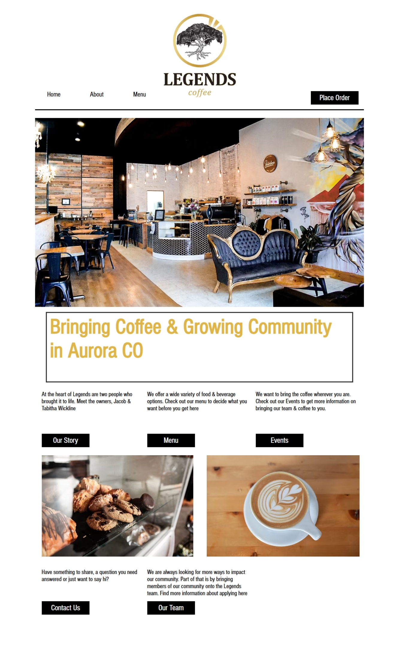
Original homepage — cluttered layout, low visual hierarchy, lack of brand palette.
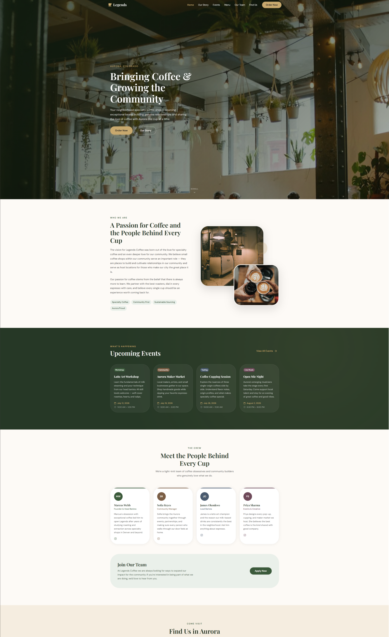
Redesigned homepage — warm hero, clear hierarchy, brand-forward typography and colors.
02 — Home Page
First impressions matter
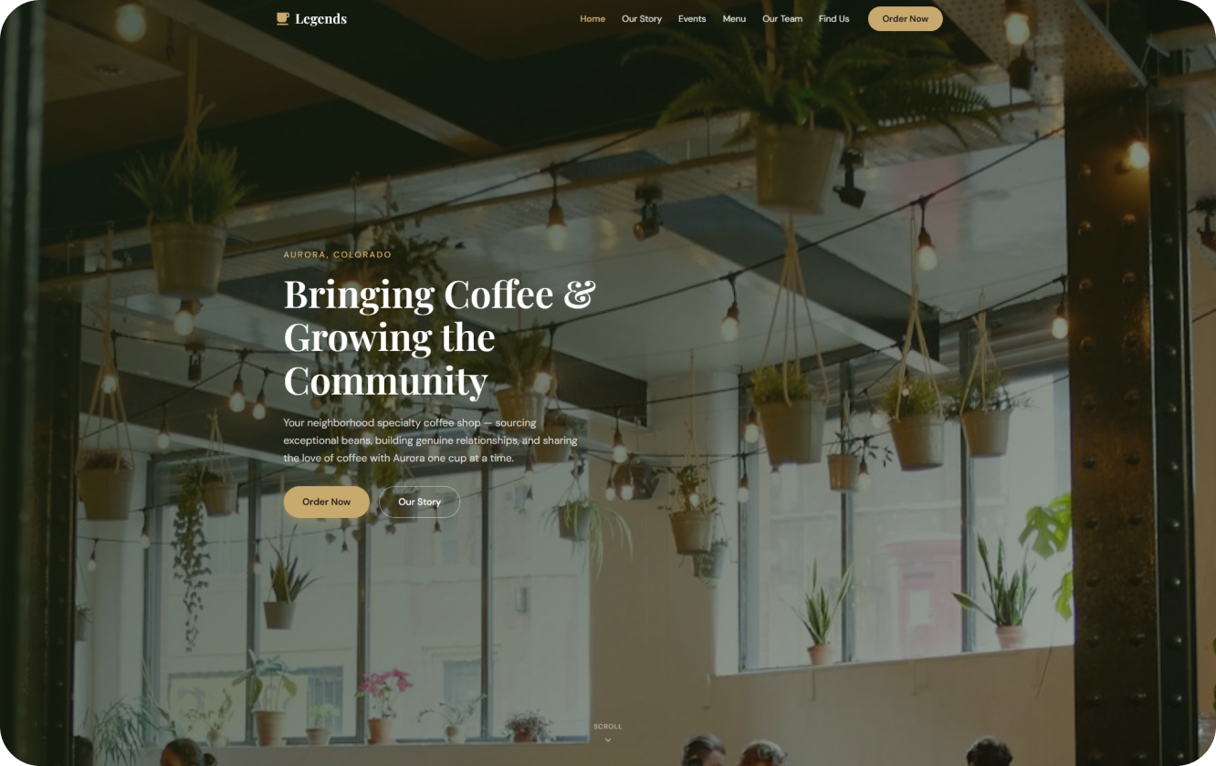
The homepage needed to do three things immediately: communicate the shop's personality, surface the most-visited pages (menu and order), and feel warm enough that a first-time visitor would want to walk through the door.
A full-bleed hero with natural light photography and the shop's signature color palette anchors the experience. Navigation is reduced to what customers actually need.
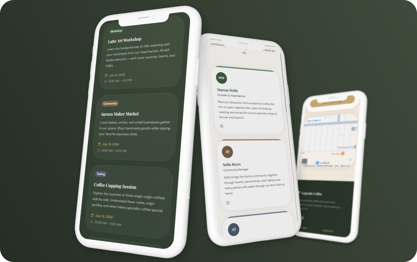
03 — Integrated Menu
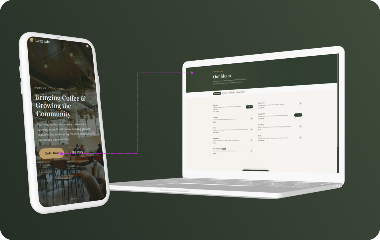
From browsing to ordering without leaving the page
The previous menu had no search, no filtering, and ordering meant jumping to a third-party platform. The redesigned menu is fully integrated: filterable by category, scannable at a glance, and connected directly to the order flow for easy pick-ups for the locals.
Every item links to a detail view with ingredients, customization options, and a direct add-to-order action — no redirect, no friction.
05 — Takeaway
Warm, inviting, and unmistakably theirs
A great local coffee spot deserves a web presence that's as thoughtful as everything else they do.
The visual design was built around the shop's physical environment — warm tones, considered typography, and design decisions tested against one question: does this feel like Legends Coffee? This project was a reminder that constraints breed creativity. Working with an existing brand, a specific community, and a real physical space to reference made every design decision more grounded — and the result more authentic — than a blank-canvas brief ever could.